What is an Underwater Plot graph and how to analyse it?
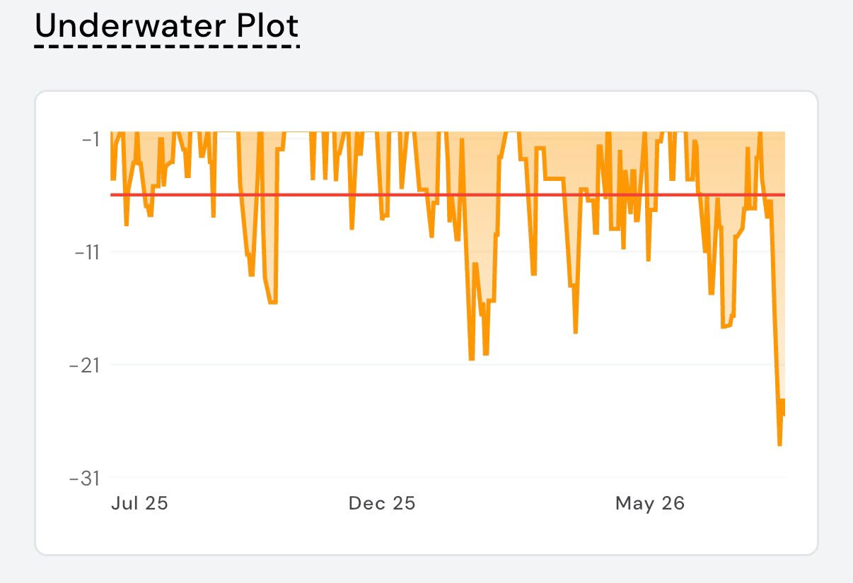
The Underwater Plot visualises an Algo’s drawdown over time. A drawdown is the decline in the Algo’s performance from its previous highest value (peak) to its lowest value (trough).
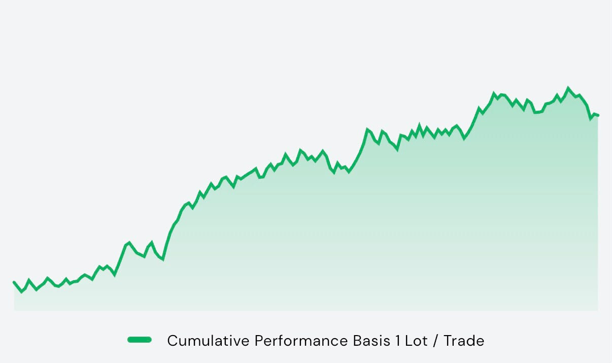
While the Equity Curve shows how an Algo has grown over time, the Underwater Plot focuses on the periods when the Algo was below its previous peak. This provides valuable insight into the risk, resilience, and recovery characteristics of the algo.
How to Read the Underwater Plot
 Line at 0%: The Algo is at its previous peak or has achieved a new all-time high. There is no active drawdown.
 Yellow Area: The Algo is in a drawdown, meaning its cumulative performance is below its previous peak.
 Depth of the Yellow Area: The deeper the yellow area, the larger the decline from the previous peak.
 Red Horizontal Line: The red line represents the Average Drawdown over the selected period.
It acts as a benchmark to compare the current drawdown with the Algo’s historical average.
-
Drawdowns above the red line are generally shallower than average.
-
Drawdowns below the red line indicate deeper-than-average declines.
 Return to 0%: When the line returns to 0, the Algo has completely recovered the losses from that previous drawdown and reached its previous peak again.
Understanding the Gaps at 0%
You may notice gaps where there is no yellow shaded area.
These gaps indicate that the Algo has already recovered from its previous drawdown and is continuing to make new highs.
Since the Algo is consistently creating new peaks, there is no drawdown to display, which is why the Underwater Plot remains at 0% during these periods.
The same periods can be observed in the Equity Curve, where the cumulative performance continues to rise without falling below the previous peak.
In simple terms:
-
Equity Curve rising to new highs ➜ Underwater Plot stays at 0%
-
Equity Curve falls from a peak ➜ Underwater Plot moves below 0%
-
Equity Curve reaches a new high again ➜ Underwater Plot returns to 0%
What Does the Underwater Plot Tell You?
The Underwater Plot provides a quick view of an Algo’s historical drawdown behaviour, showing how deep the drawdowns were, how long they lasted, how quickly the Algo recovered, and how consistently it reached new equity highs over time. It helps you assess the Algo’s overall risk and resilience.
How to Interpret It
A good Underwater Plot generally exhibits:
-
Shallower drawdowns
-
Shorter recovery periods
-
Frequent returns to 0%
-
Longer stretches at 0%, indicating consistent new highs
-
Limited periods of deep drawdowns
Conversely, deeper and prolonged drawdowns indicate that the Algo spent more time recovering before reaching new highs.
Key Takeaway
The Underwater Plot helps you look beyond returns and evaluate the risk behind the performance. It provides a clear picture of an Algo’s drawdown behaviour, resilience, and recovery over time, enabling you to make more informed comparisons and investment decisions. When used alongside the Equity Curve, it offers a more complete assessment of an Algo’s historical performance.
I hope this provides clarity.
3 Likes